Container
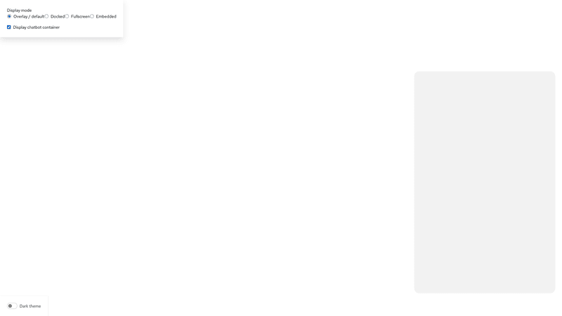
The PatternFly chatbot is a separate window that overlays or is embedded within other UI content. This container can be shown and hidden via the chatbot toggle.
The <Chatbot> component is the container that encompasses the chatbot experience. It adapts to various display modes (overlay/default, docked, fullscreen, and embedded) and supports both light and dark themes.
The "embedded" display mode is meant to be used within a PatternFly page or other container within your product.
Content and message box
The <ChatbotContent> component is the container that is placed within the <Chatbot>, between the <ChatbotHeader> and <ChatbotFooter>.
<ChatbotContent> usually contains a <ChatbotMessageBox> for displaying messages.
Your code structure should look like this:
<Chatbot>
  <ChatbotHeader ... />
  <ChatbotContent>
    <ChatbotMessageBox>
    ...
    <ChatbotMessageBox>
  </ChatbotContent>
  <ChatbotFooter ... />
</Chatbot>Note: When messages update, it is important to announce new messages to users of assistive technology. To do this, make sure to set the announcement prop on <MessageBox> whenever you display a new message in <MessageBox>. You can view this in action in our basic chatbot and embedded chatbot demos.
Welcome prompt
To introduce users to the chatbot experience, a welcome prompt can fill the message box before they input their first message. This brief message should follow our conversation design guidelines to welcome users to the chatbot experience and encourage them to interact.
To provide users with a more specific direction, you can also include optional welcome prompts.
Hello, Chatbot User
How may I help you today?
Props
Chatbot
| Name | Type | Default | Description |
|---|---|---|---|
| childrenrequired | React.ReactNode | Content to be displayed in the chatbot | |
| className | string | Custom classname for the Chatbot component | |
| displayMode | ChatbotDisplayMode | ChatbotDisplayMode.default | Display Mode for the Chatbot |
| isVisible | boolean | true | Visibility flag for the chatbot |
ChatbotContent
| Name | Type | Default | Description |
|---|---|---|---|
| childrenrequired | React.ReactNode | Content to be displayed in the chatbot | |
| className | string | Custom classname for the ChatbotContent component |
MessageBox
| Name | Type | Default | Description |
|---|---|---|---|
| childrenrequired | React.ReactNode | Content to be displayed in the message box | |
| announcement | string | Content that can be announced, such as a new message, for screen readers | |
| ariaLabel | string | 'Scrollable message log' | Custom aria-label for scrollable portion of message box |
| className | string | Custom classname for the MessageBox component |
ChatbotWelcomePrompt
| Name | Type | Default | Description |
|---|---|---|---|
| descriptionrequired | string | Welcome message | |
| titlerequired | string | Title for the welcome message | |
| className | string | Custom classname for the WelcomePrompt component | |
| prompts | WelcomePrompt[] | Custom basic prompts to help users coming for the first time to chatbot |
WelcomePrompt
| Name | Type | Default | Description |
|---|---|---|---|
| messagerequired | string | Message for the welcome prompt | |
| onClick | () => void | Callback handler for the onClick event for welcome prompt | |
| title | string | Title for the welcome prompt |

