For information on other forms of on-screen help, see popover and hint.
Usage
Use tooltips to:
- Provide labels for unlabeled icons.
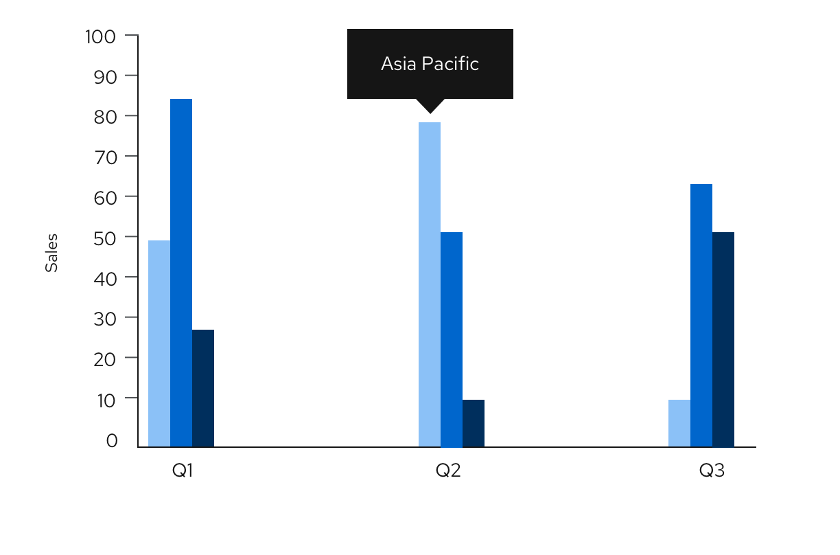
- Provide additional information on a data point or element in a chart or table.

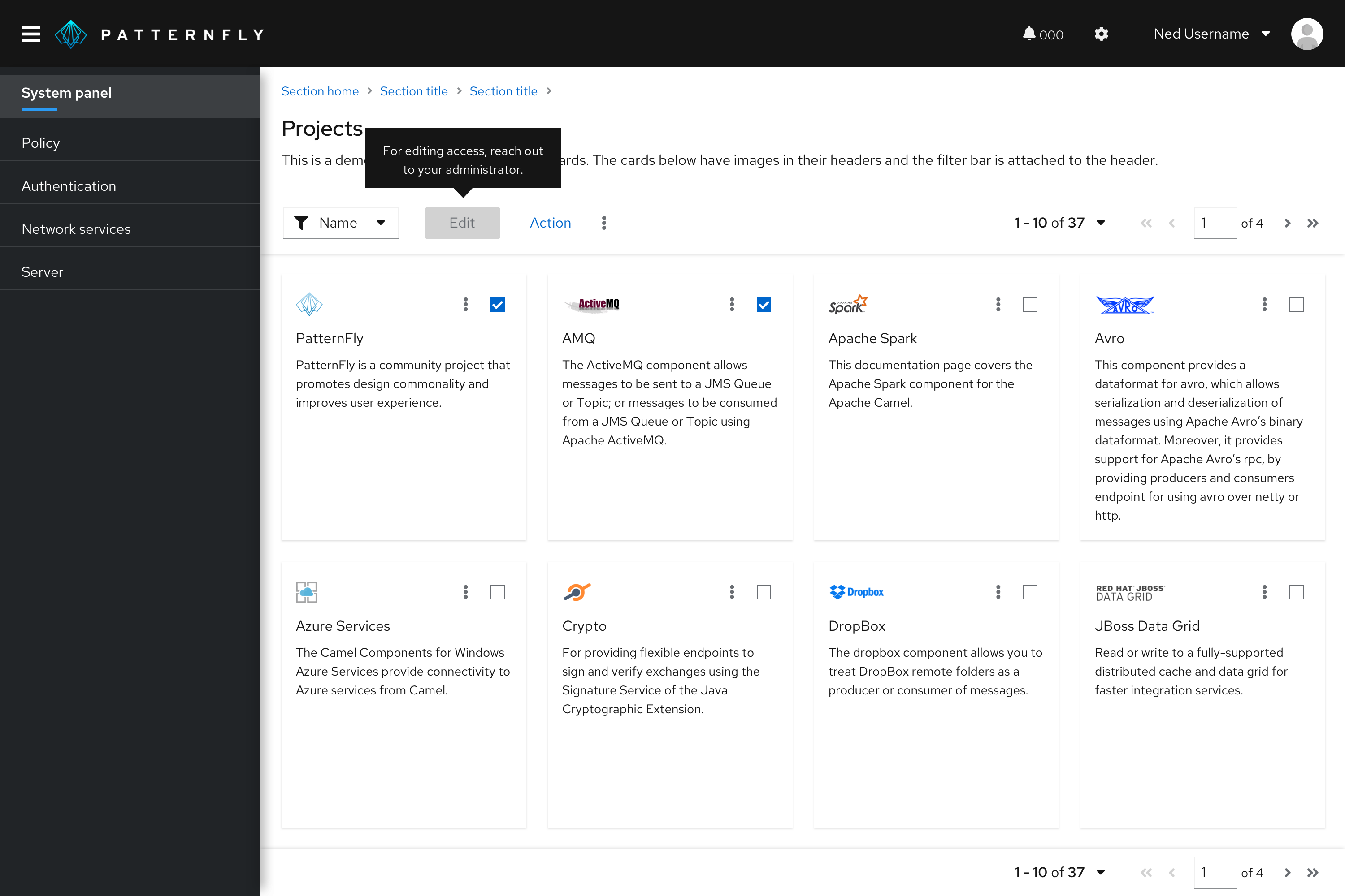
- Define new or unfamiliar UI elements that aren’t described directly in the user interface. For example, you can use a tooltip on a disabled button.

Tooltip delay on hover
By default, tooltips have a 300ms entry delay when hovering over an object. Although this is the recommended delay time, you may customize it via prop. For example, if you have a tooltip on an icon, and you would like for it to appear immediately on hover, you may set the delay to 0 ms.
When to use tooltips vs. popovers
Both tooltips and popovers provide more information in context for users. However, they’re different in a few ways:
- Tooltips are used for identification purposes, while popovers are used for added description or information in context.
- Tooltips contain short descriptions or labels, while popovers contain longer descriptions, formatted text, and optional images or links.
- Tooltips appear on hover, while popovers appear on click.
Content considerations
- Keep your tooltips clear and concise. Use the fewest number of words without sacrificing meaning.
- If the tooltip is a full sentence, include a period at the end. If the tooltip is a fragment, do not include a period at the end.
- Use tooltips for additional information. Don’t use tooltips for information critical to a user completing a task, such as password character requirements.
- Tooltips should provide new and valuable information. Never use a tooltip to repeat information already available in the UI.
- Don’t use tooltips with question-circle icons to present contextual information in forms and other areas. Instead, use a popover.
Accessibility
For information regarding accessibility, visit the tooltip accessibility tab.
View source on GitHub

