About
The @patternfly/quickstarts extension is made up of two parts: Quick starts and In App Documentation product documentation tools.
Full live demo application
A live demo of Quick starts and In App Documentation can be found here, or view the demo code.
A few key concepts are outlined below.
Quick starts
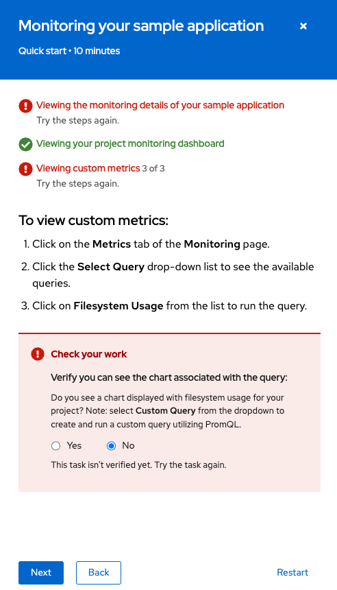
A Quick start is a set of step-by-step instructions and tasks presented in a side panel embedded in a product’s UI. Quick starts can help users get started with a product, and they often provide guidance around installation and setup.
Each task in a quick start has multiple steps, and each quick start has multiple tasks. The outcome of the quick start includes the artifacts or state needed to successfully use the product, specific features, or add-ons.
For more detailed design guidelines and visuals see here.
Quick start format
For developers
A detailed breakdown of the Quick start format in code can be seen here.
Quickly preview a basic example, and remember there is a live demo with full demo code.
For content authors
Quick starts can be written in yaml with markdown support, asciidoc, or just json. For examples of each of these formats see here
Opening and closing the side panel
Custom handler
Open the side panel by calling the setActiveQuickStart or setActiveQuickstartID methods. These methods are provided by the QuickStartContext and can be accessed in your React components:
const { setActiveQuickStart } = React.useContext<QuickStartContextValues>(
    QuickStartContext,
  );
Quick start catalog
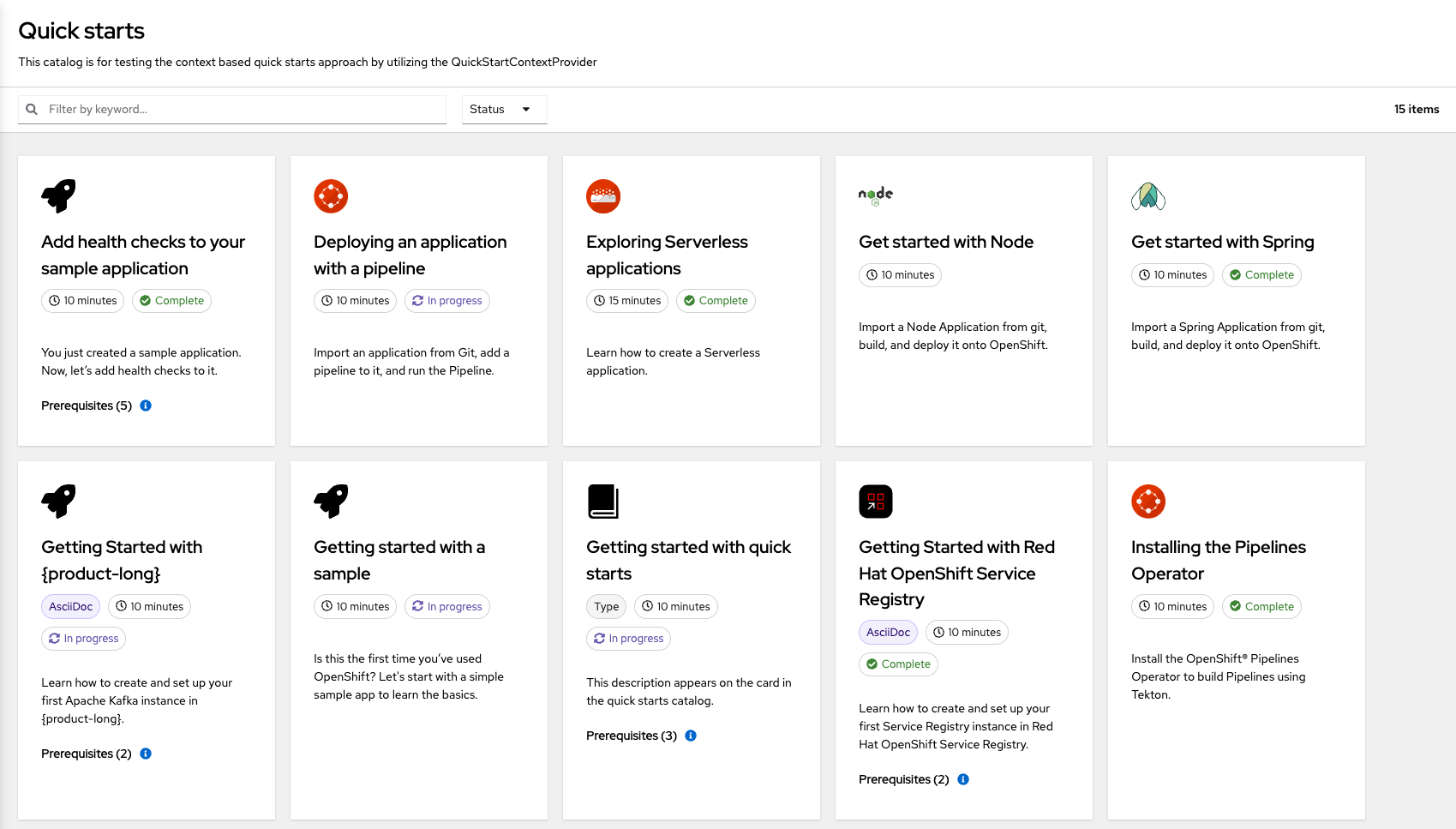
By providing a set of quick starts to the QuickStartContainer, a full page catalog view will be generated. Clicking on a catalog card will open its respective Quick start in the side panel.
In-app documentation
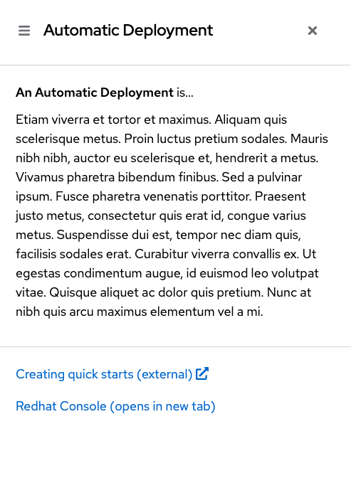
In App Documentation is used to provide definitions for a set of topics relevant to your product. A single unit of In App Documentation can be called a HelpTopic, which is also the name used in code. HelpTopic's essential sections are a content section that contains a definition of the term or topic, and an optional list of links to provide the user with other relevant information.
HelpTopics are displayed in a side panel just like Quick starts:
Help Topic format
For developers
A detailed breakdown of the HelpTopic format in code can be seen here.
Quickly preview a basic example, and remember there is a live demo with full demo code.
For content authors
HelpTopics are written in yaml with markdown support. An example can be seen here
Opening and closing the side panel
Open the side panel by calling setActiveHelpTopicByName (available from HelpTopicContext) with a HelpTopic's name value.
const { setActiveHelpTopicByName } = React.useContext<HelpTopicContextValues>(HelpTopicContext);Close it by calling setActiveHelpTopicByName with an empty string. There is no prebuilt HelpTopic catalog. simply attach a handler with setActiveHelpTopicByName to the appropriate DOM element. See the basic example, or live demo code for more details.
View source on GitHub