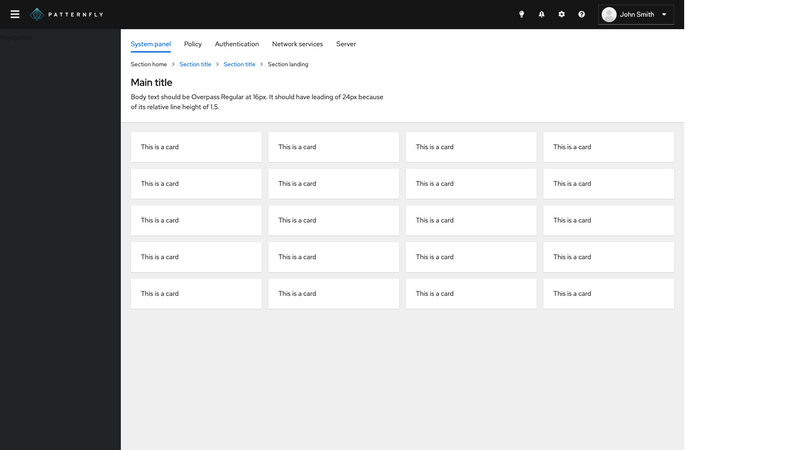
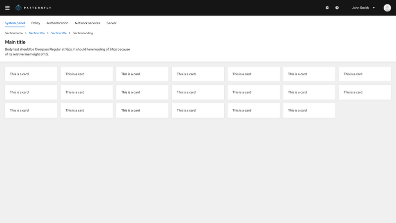
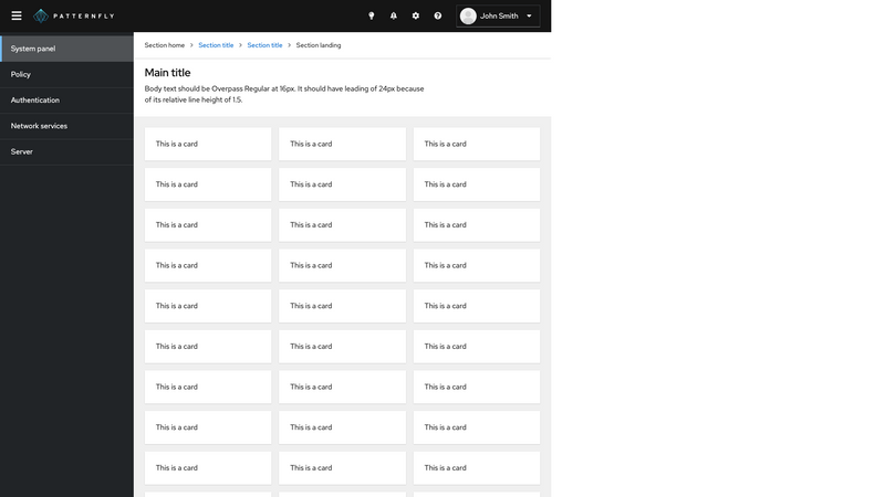
All but the last example set the
isManagedSidebarprop on the Page component to have the sidebar automatically close for smaller screen widths. You can also manually control this behavior by not adding theisManagedSidebarprop and instead:- Add an onNavToggle callback to PageHeader
- Pass a boolean into the isNavOpen prop to PageSidebar
The last example demonstrates this.
To make the page take up the full height, it is recommended to set the height of all ancestor elements up to the page component to
100%
Layouts
This demonstrates a variety of navigation patterns in the context of a full page layout. These can be used as a basis for choosing the most appropriate page template for your application.
Sticky section group (using PageHeader)
This demo is provided becuase PageHeader and PageHeaderTools are still in use; however, going forward Masthead and Toolbar should be used to make headers rather than PageHeader and PageHeaderTools.
Sticky section group (alternate syntax and using PageHeader)
Please see this note regarding PageHeader.
View source on GitHub


