Elements
A card usually consists of four parts:
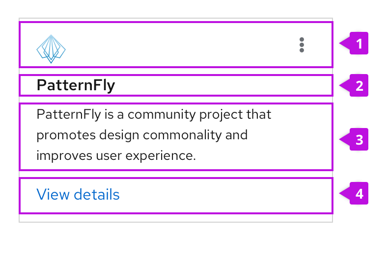
- Header (optional): When included, defines the contents of a card. Card headers can contain images as well as the title of a card and an actions menu represented by the right-aligned kabob. In most cases, your card should include a header. The only exceptions are when cards being used as a layout element to create a white background behind other content.
- Title (optional): Communicates the title of a card if it's not included in the header.
- Body: Provides details about the item. A card body can include any combination of static text and/or active content.
- Footer (optional): Contains links, actions, or static text at the bottom of a card.
Usage
Cards primarily appear in catalog views, primary-detail views, and dashboards.
When to use
Use cards to:
- To visually group content or distinguish information from the rest of a page’s content. Examples include dashboards and catalog views.
- To organize content in layouts with multiple columns or grids.
- To compare separate groups of information.
- To make media easier to scan, such as images or videos.
When not to use
Never use a card to show a dense amount of repetitive, related content. Use a data list or table view instead.
Images
Only include meaningful images on your cards (don’t add them for decoration). Images should help users identify specific content types.
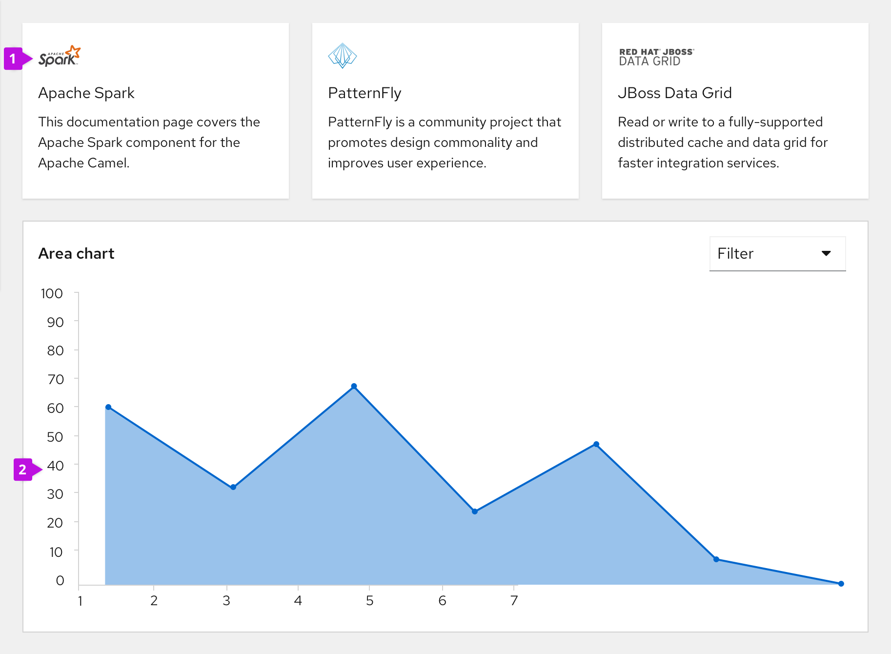
- Place smaller images inside the card’s header.
- Place larger images or charts within the card’s body.
Border treatments
PatternFly offers 2 types of border treatments for cards:
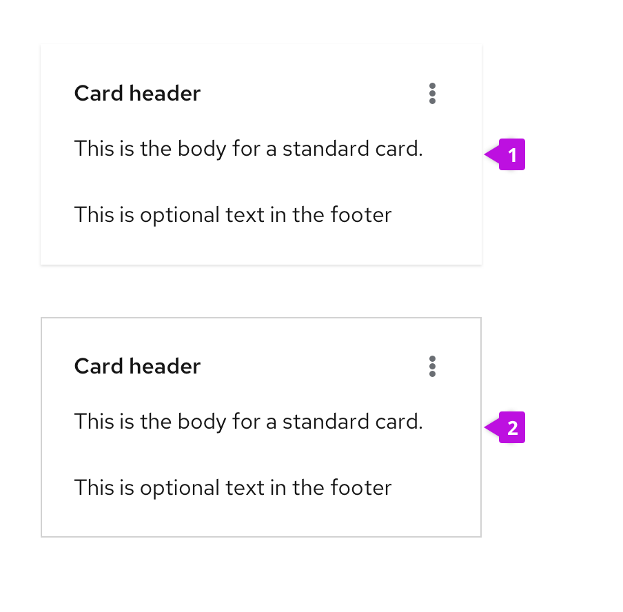
- Default card: By default, cards will have a thin (1px) drop shadow to differentiate them from the background of a page and give them a slightly raised appearance. Use the default appearance when placing cards on a gray background.
- Flat card: Flat cards have a 1px gray border. Flat cards are recommended for use against a white background as the solid border will better differentiate a card from the page background.
Cards in catalog views
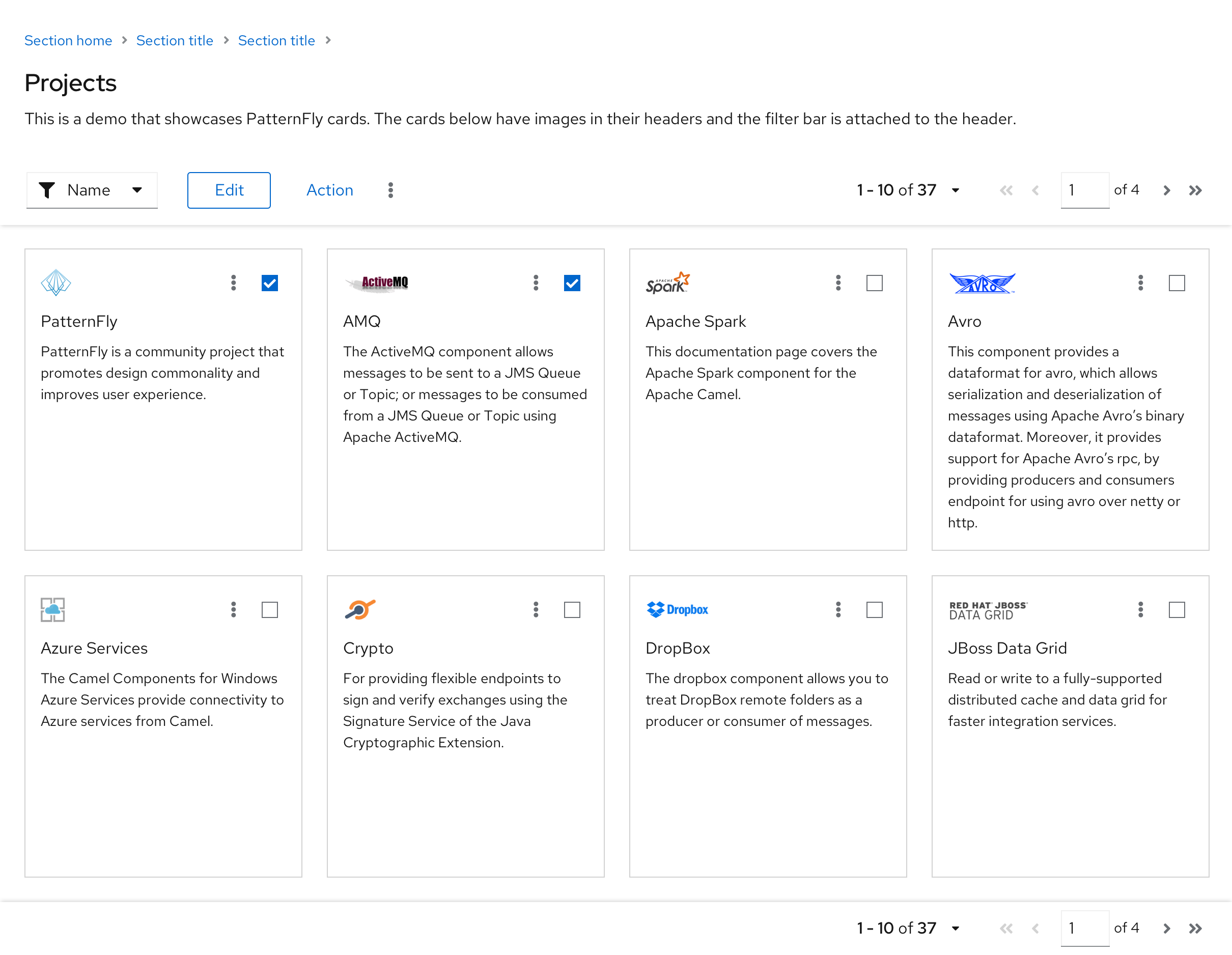
Use cards in a catalog view to present users with a series of selectable items, typically arranged into a grid.
Note that this view uses a multi-select card so that bulk actions can be performed from the toolbar on a group of cards at once. For more information on cards used in a catalog or card view, see the card view design guidelines.
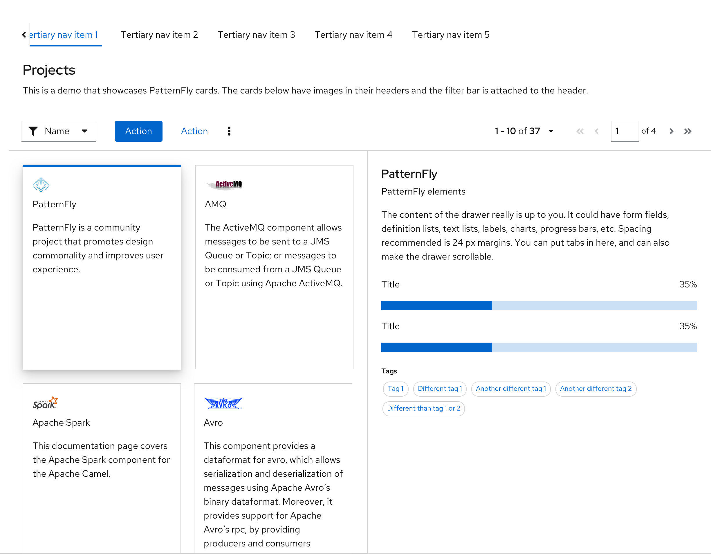
Cards in primary-detail views
Use selectable cards when you want to present an overview of a set of objects and then examine the details. Here, the details of different projects can be displayed in a side-by-side primary-detail view.
Cards in dashboards
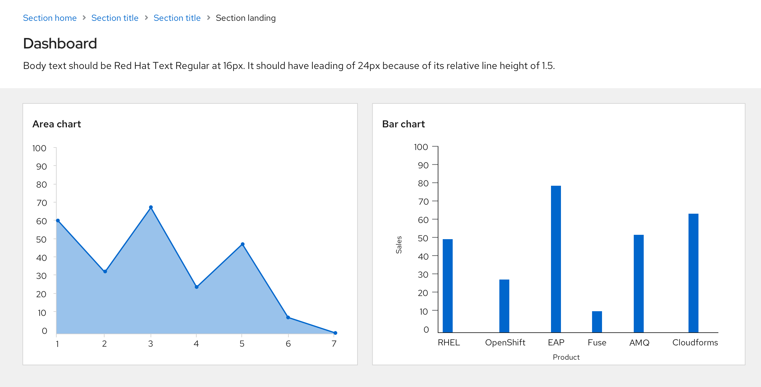
Use cards in a dashboard view to visualize information. Each card should display a different and specific piece of information, such as a bar chart, area chart, or other data type.
Variations
Cards are flexible and customizable to your use case. Here are some different ways to use a card to represent the same content. Choose a layout that considers the usage context and the space you have to work with.

- The first version places an image in the header with a separate title. The View details action is located in the footer.
- In the second version, the title is moved to the header area to give a more compact footprint.
- In the third version, the card header contains an image as well as text to define the card title. The title is a link, allowing users to drill into the details of the card. This makes the footprint of the card smaller.
Expandable cards
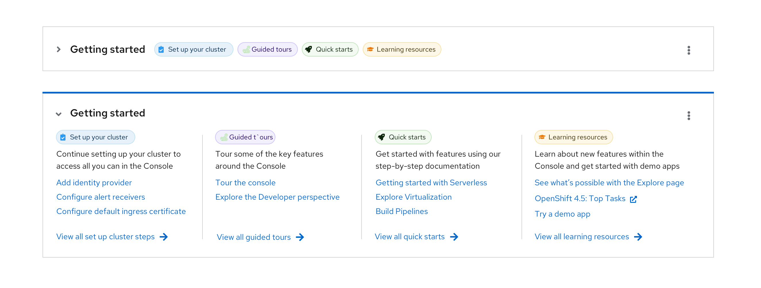
The header element can be made expandable in situations where you want to hide the card content and reduce its footprint. In the collapsed state, only the card title is shown, and the user can click the expansion toggle to view the rest of the card content.
Selectable cards
It is often useful to make cards selectable. PatternFly supports two types of selectable cards:
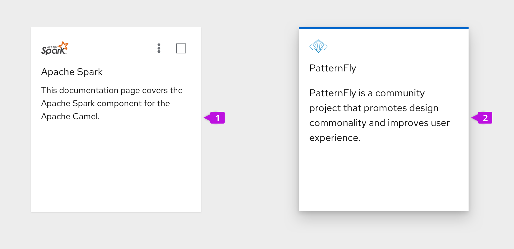
- Multi-select card: Features a checkbox in the upper righthand corner, which users can select to indicate which cards to include in global actions.
- Selectable card: Features a raised appearance and blue border treatment when selected.
Spacing
Content spacing
PatternFly supports three types of cards:
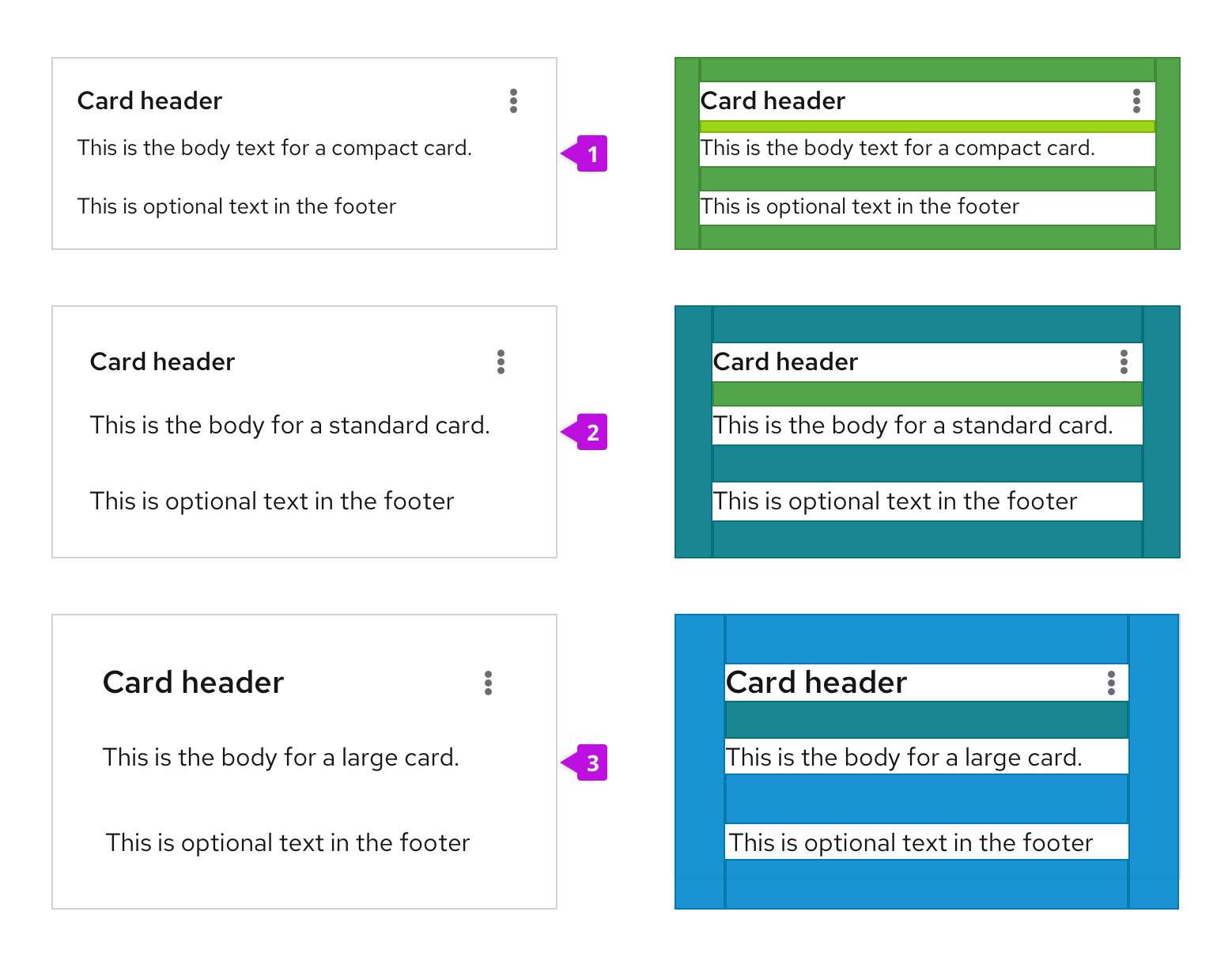
- Compact (recommended): Compact cards use 16px spacing with an 8px spacer between the header and body, and a 16px spacer between the body and footer.
- Standard: Standard cards use 24px spacing with a 16px spacer between the header and body and 24px between the body and footer.
- Large: Large cards use 32px spacing with a 24px spacer between the header and the body and 32px between the body and footer. Large cards are generally used for presenting marketing content or anyplace where a lower content density is desired.
Accessibility
For information regarding accessibility, visit the card accessibility page.
View source on GitHub

