Usage
When to use
- The selection process would benefit from having the additional visual prominence that tiles provide.
- The selection includes additional information, like a brief description or an icon.
- The selection consists of brief, static content.
- There are few (typically 2-6) selections for the user to choose from.
When not to use
- The option presented to the user includes an action link, button, or overflow menu. Instead, use a card.
- The option presented to the user requires more than 3 lines of content description. Instead, use a card.
- The option opens an additional resource or triggers an action. Instead, use a card.
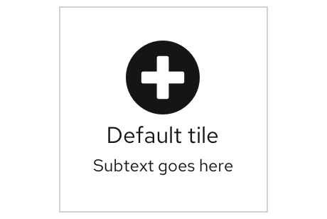
Example
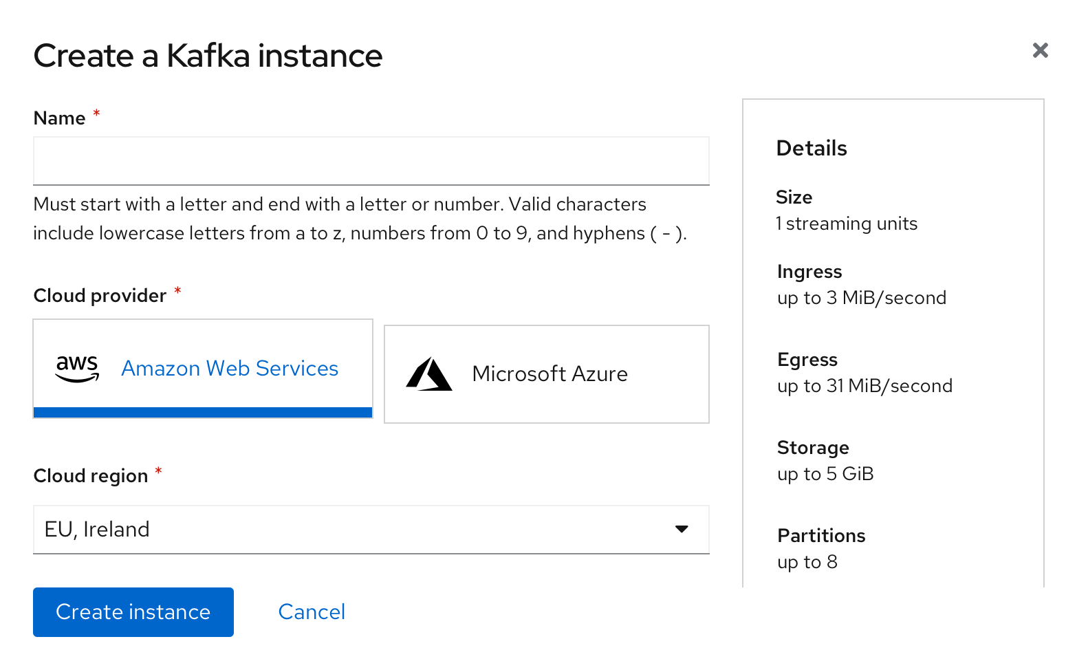
Behavior
As the user hovers over the tile component, the color will change insinuating its clickability. Once the user chooses the title, it will appear with a blue border showing it has been selected.
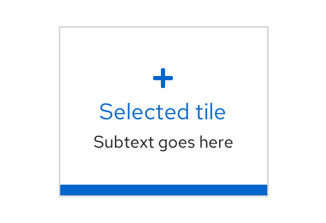
Variations
Basic
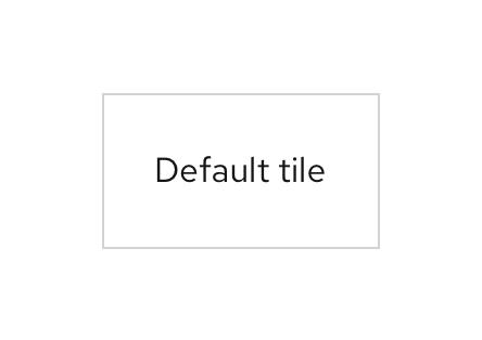
Subtext
Icon
View source on GitHub