The drag and drop interaction can be used to reposition elements on screen into a layout that benefits the user. This gives the user more flexibility to arrange and/or group items without having to make code changes.
Usage
Simple list
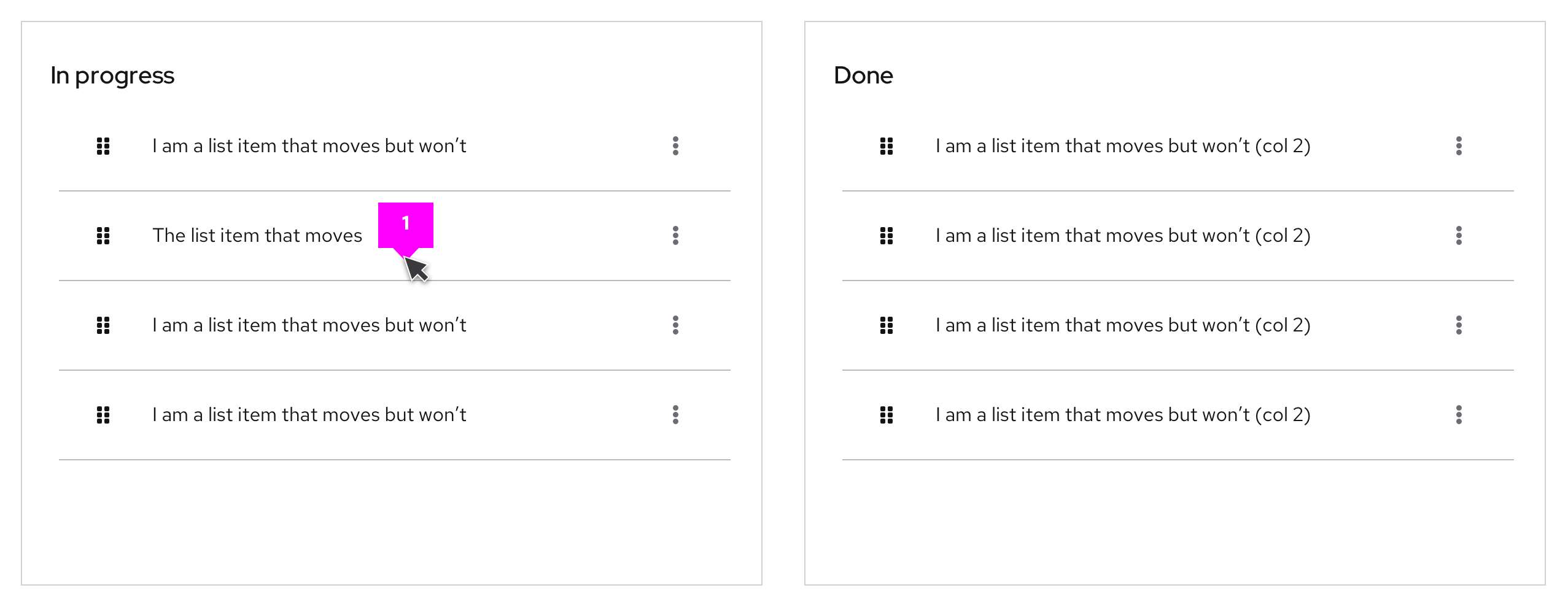
- Draggable area: The drag and drop interaction can be triggered with click and hold over any part of the item. The
fa-gripicon is used to show that the drag and drop interaction is available.
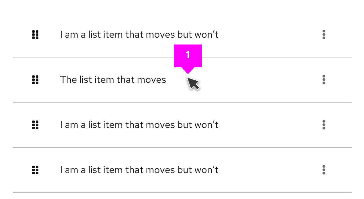
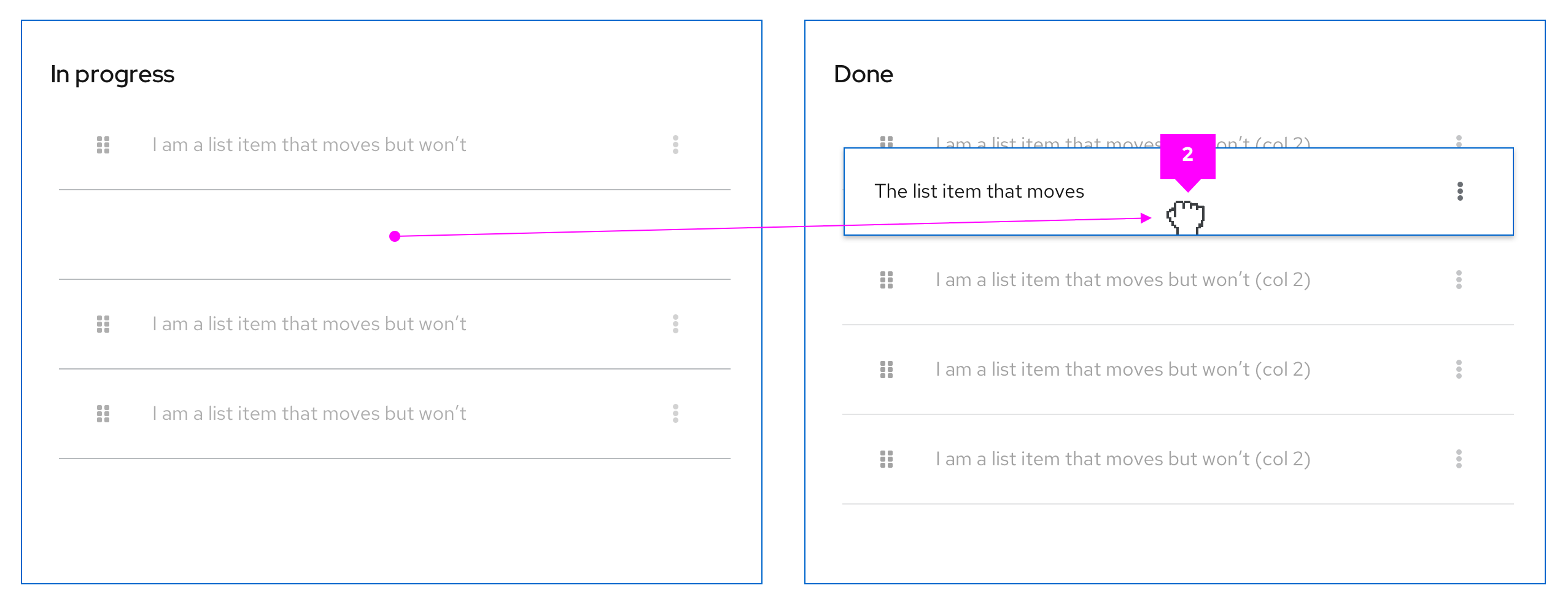
Bounding box: Upon click & hold a
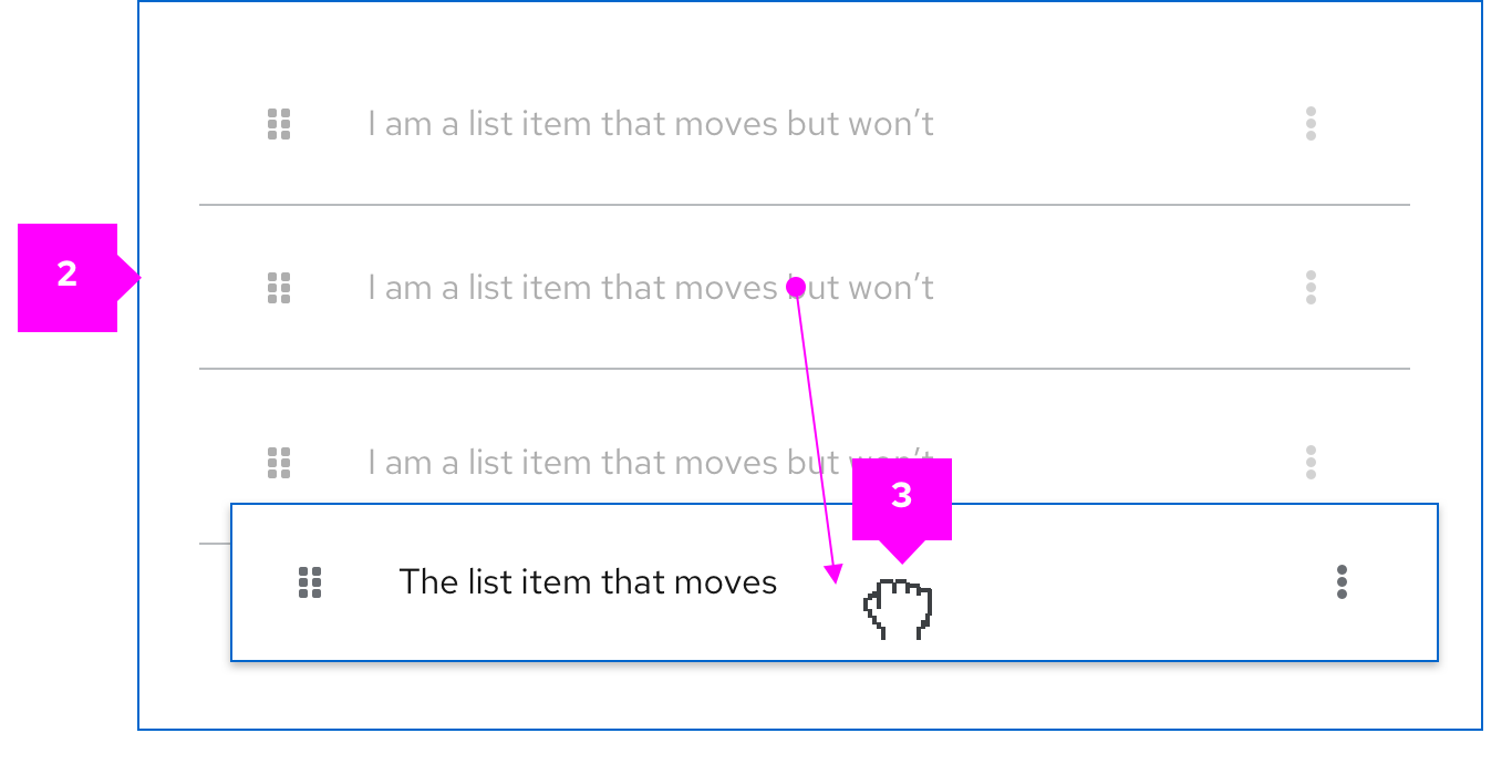
--pf-global--active-color--100border will show the draggable area that is available.onDrag event: The list item being dragged will also use a
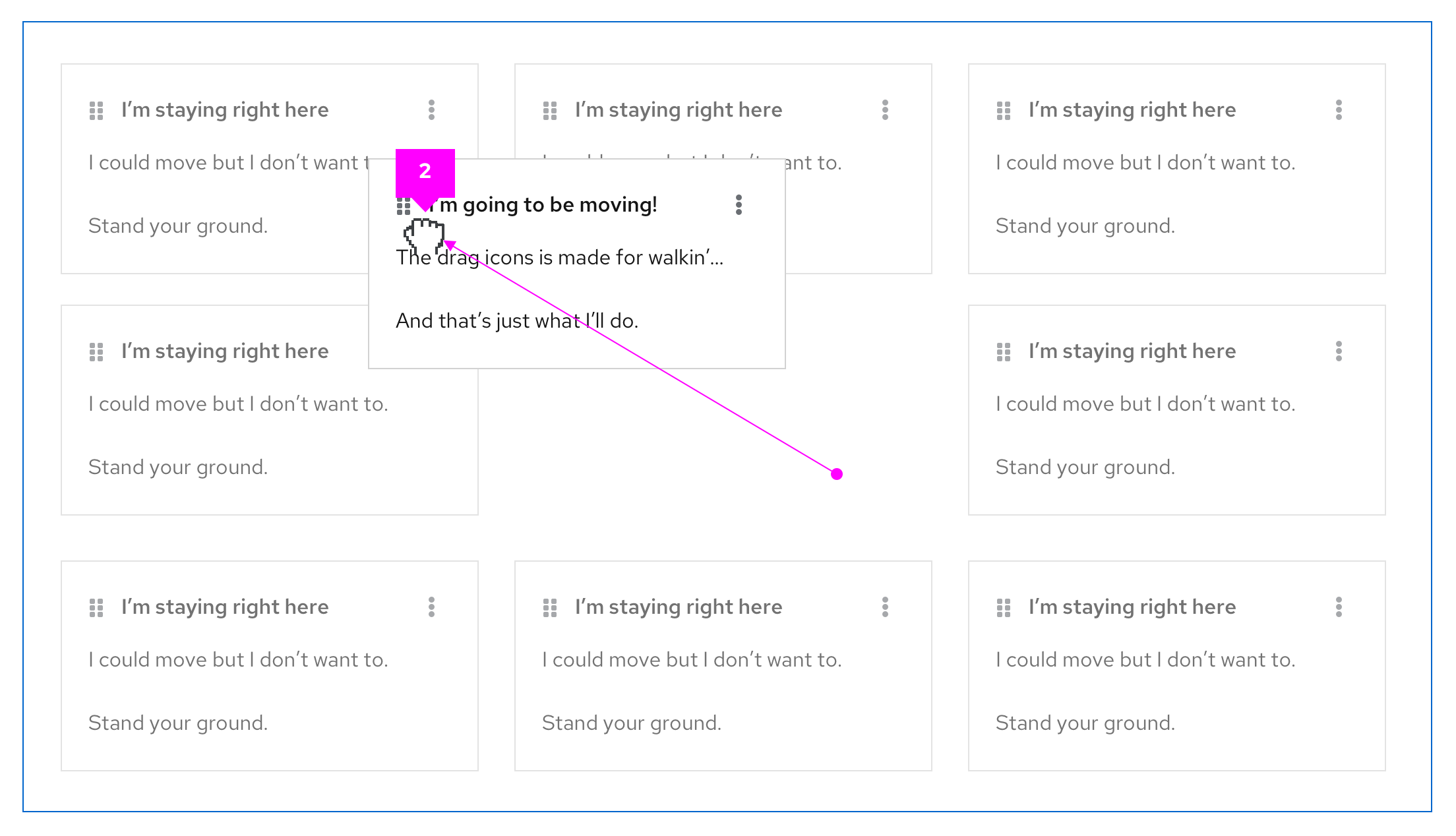
--pf-global--active-color--100border to highlight it as the item being dragged and all other list items will switch to a disabled state. The space where the item is being dragged from will remain empty to indicate its original position in the list.
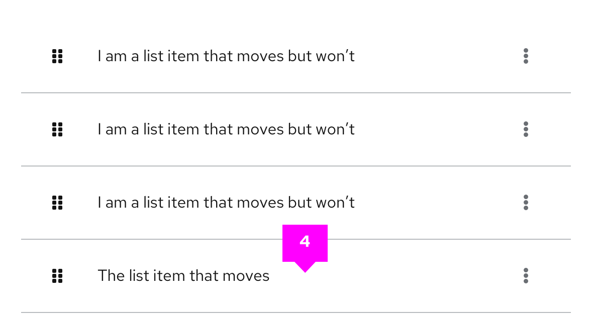
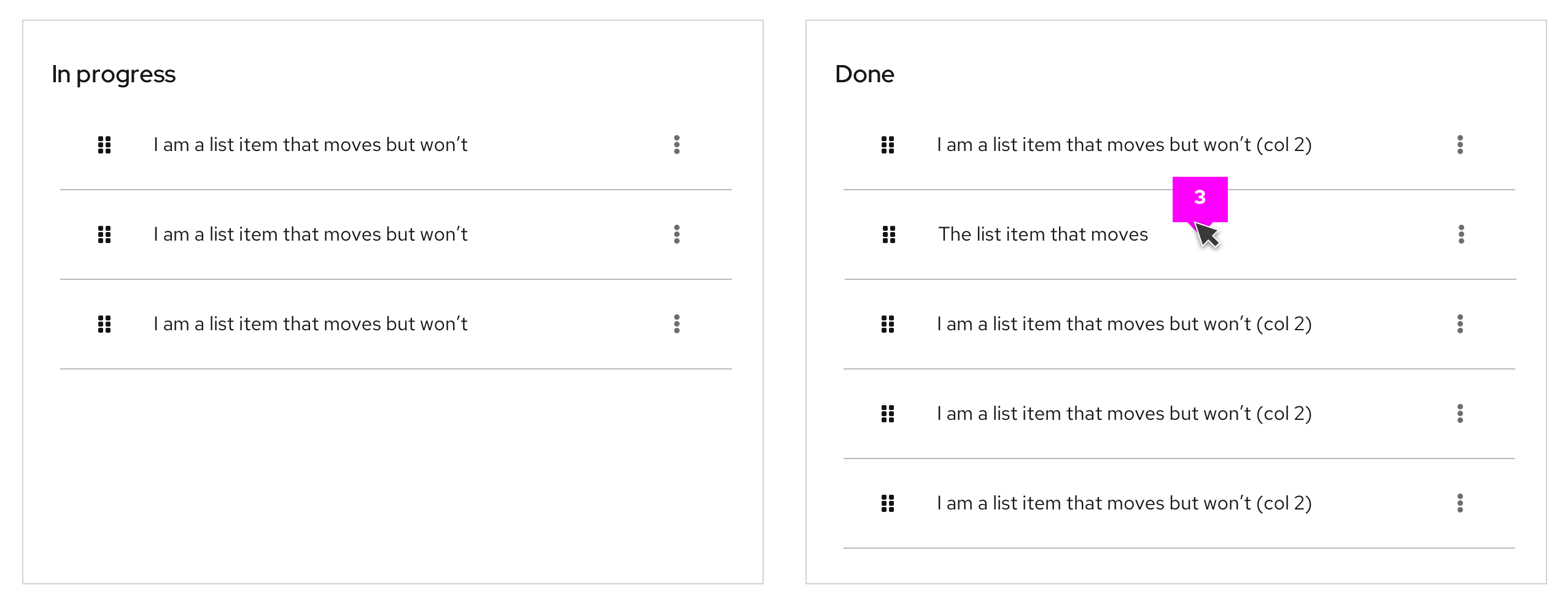
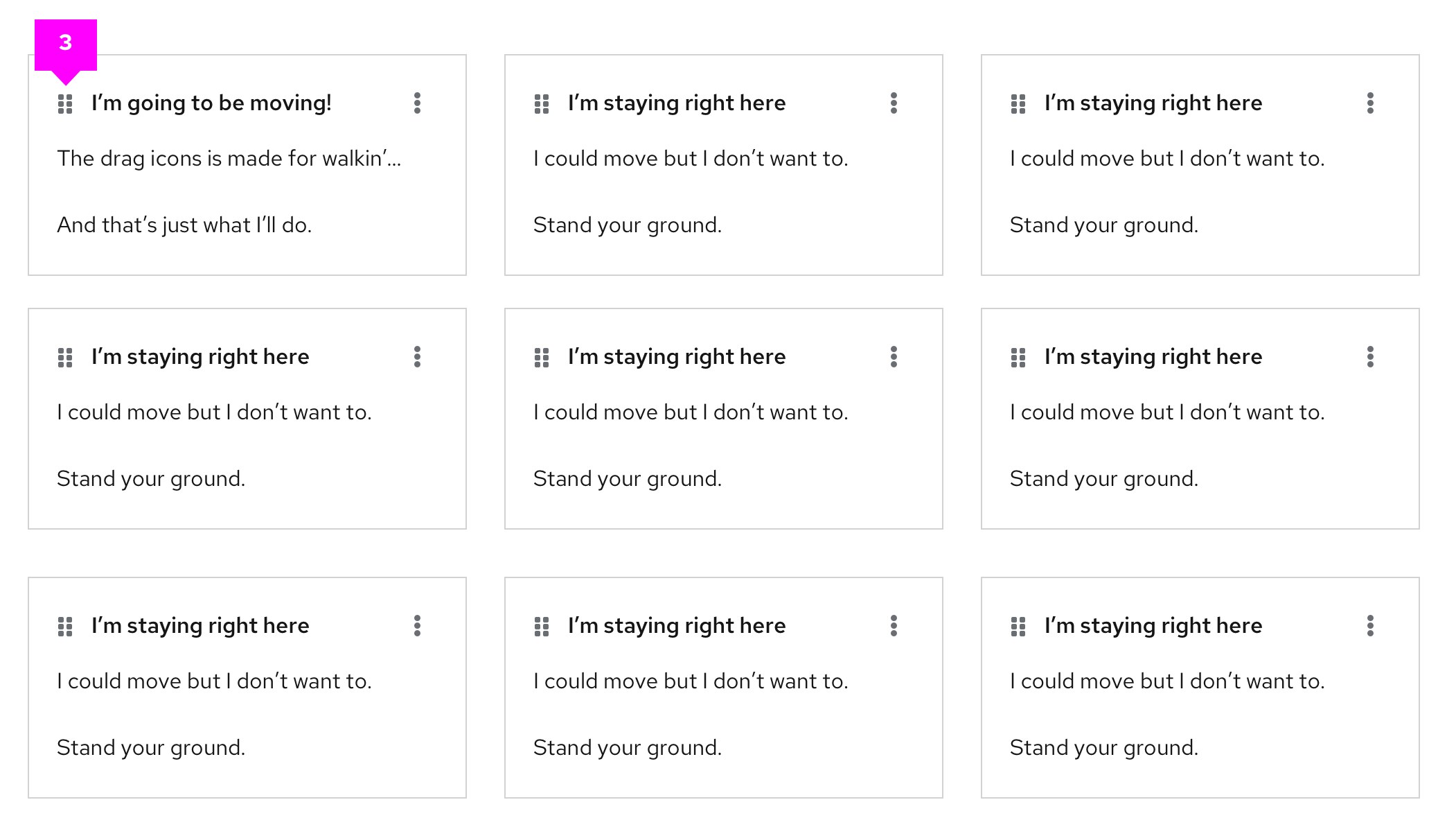
- postDrag event: Once dropped, the items will be reordered based on the user’s action. The space left empty is then filled by the next item in the list.
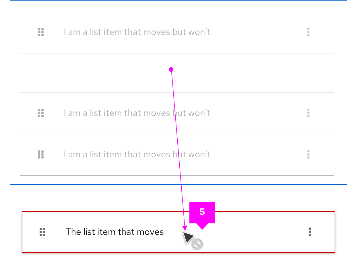
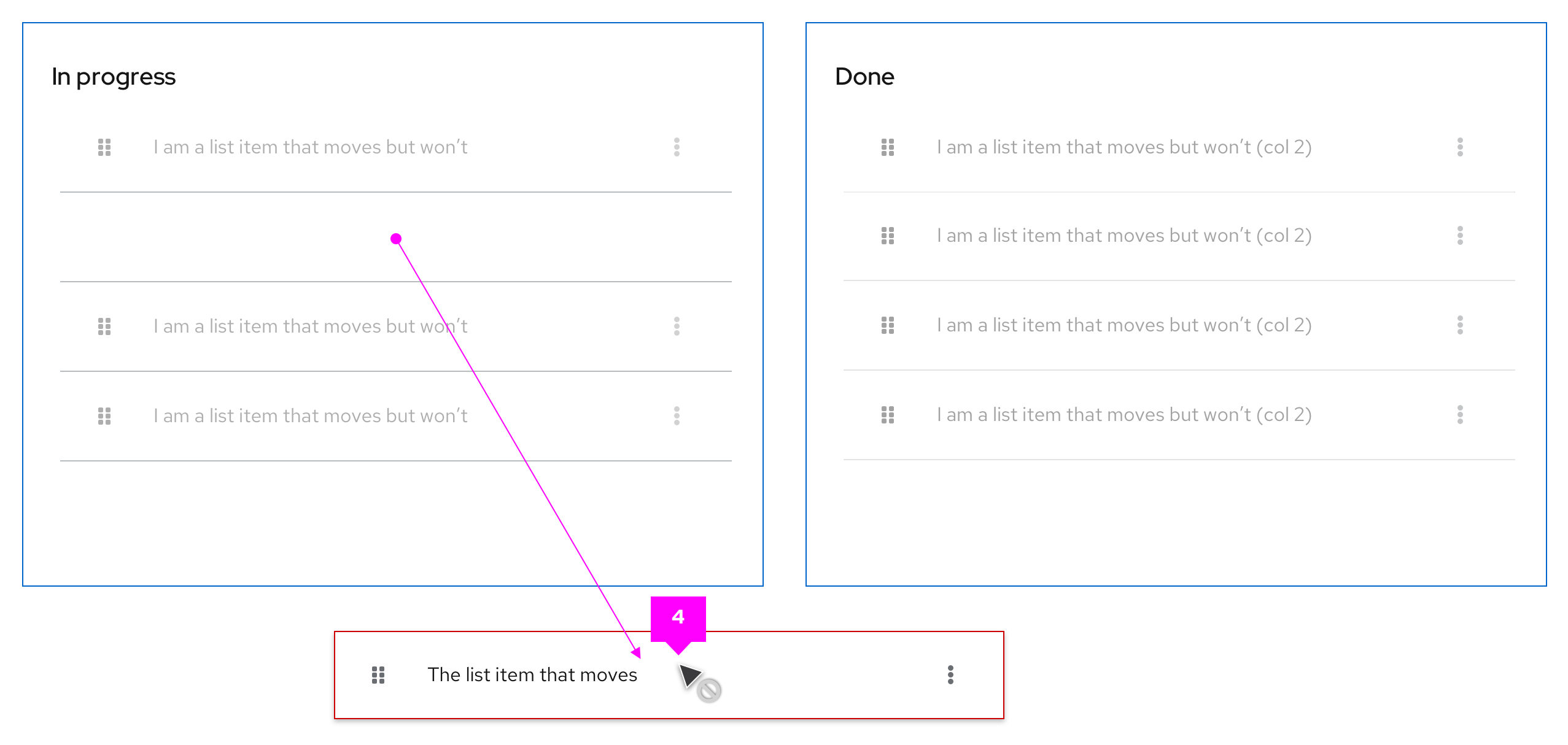
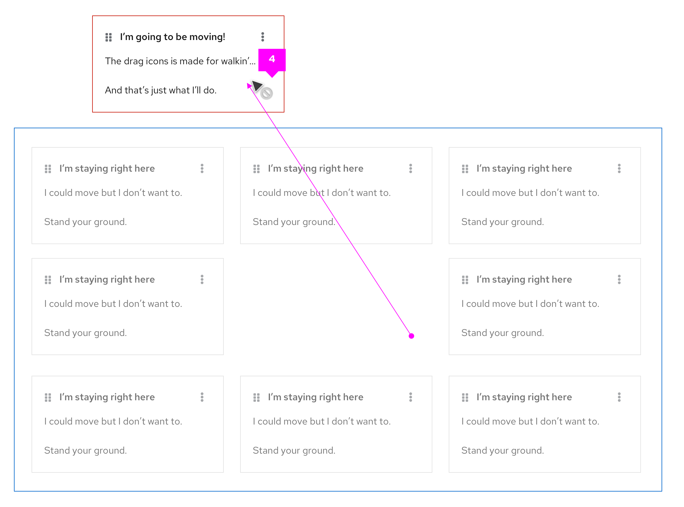
- Error state: If the list item is dragged outside the bounding box the borders on the dragged item will switch to
--pf-global--danger-color--100and the cursor will change tonot-allowedto indicate an invalid placement. If the user releases the cursor outside the bounding area the dragged item will return to its default position.
Multiple lists
PatternFly drag and drop allows users to move items between different list groups. For example, in a To-Do list scenario users can quickly drag list items from the ”In progress” column to the “Done” column.
- Draggable item
- onDrag event
- postDrag event
- Error state
Draggable cards
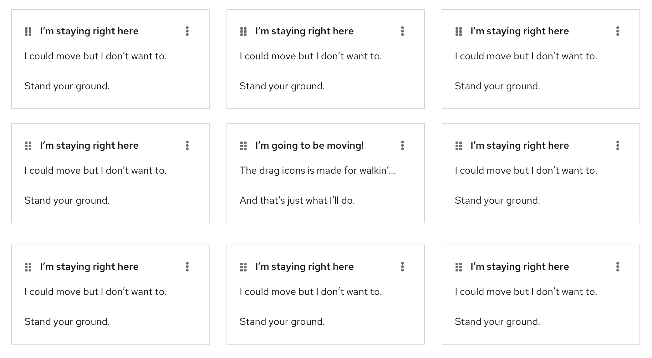
In a card view, when the selected card has been dropped the others will reposition following a left-to-right flow by default.
- Draggable item
- onDrag event
- postDrag event
- Error state
View source on GitHub

