Our font family
We use Red Hat Display and Red Hat Text. Red Hat Display should be used for larger text headlines, while Red Hat text should be used for smaller subheaders and body text, for better long-form readability.
DOWNLOADUsage guidelines
Use typography to create visual hierarchy. A consistent and logical hierarchy makes it easier for users to quickly scan and understand information on a page.
There are two components that can be used to place text content on a page. The text component should be used for creating formatted blocks of text content and accepts all general HTML text formatting tags, including heading, paragraph, and list styles. The title component is intended to be used specifically for headings or title text in cards or in similar elements. Title provides the flexibility to set the size of the text and heading level independently.
The table below lists all common text styles that are used in PatternFly applications, how they should be used, style settings, and default heading levels, where applicable. Here are further details about the information contained in the table:
Font family, font weight, line height, and font size: These are the styles applied to that text category in the PatternFly CSS.
Text style: This is the name used to refer to that text style in the PatternFly design kit.
Font size CSS variable: This is the CSS variable that controls the size of this text. You can customize type sizes in your application by modifying the values associated with these variables. In general, this is not advised, and should only be done with caution, as changes to text style can have far reaching side effects on spacing within certain components.
Super hero heading (4xl)
| Font family: | RedHatDisplay |
| Font weight: | 400 (medium) |
| Line height: | 1.3 |
| Font size: | 36px |
| Text style: | 4xl (RHD md 36) |
| Font size CSS variable: | --pf-global--FontSize--4xl |
Hero heading (3xl)
| Font family: | RedHatDisplay |
| Font weight: | 400 (medium) |
| Line height: | 1.3 |
| Font size: | 28px |
| Text style: | 3xl (RHD md 28) |
| Font size CSS variable: | --pf-global--FontSize--3xl |
First level heading (2xl, h1)
| Font family: | RedHatDisplay |
| Font weight: | 400 (medium) |
| Line height: | 1.3 |
| Font size: | 24px |
| Text style: | 2xl (RHD md 24) |
| Font size CSS variable: | --pf-global--FontSize--2xl |
Second level heading (xl, h2)
| Font family: | RedHatDisplay |
| Font weight: | 400 (medium) |
| Line height: | 1.5 |
| Font size: | 20px |
| Text style: | xl (RHD md 20) |
| Font size CSS variable: | --pf-global--FontSize--xl |
Third level heading (lg, h3)
| Font family: | RedHatDisplay |
| Font weight: | 400 (medium) |
| Line height: | 1.5 |
| Font size: | 18px |
| Text style: | lg (RHD md 18) |
| Font size CSS variable: | --pf-global--FontSize--lg |
Fourth level heading (md, h4)
| Font family: | RedHatDisplay |
| Font weight: | 400 (medium) |
| Line height: | 1.5 |
| Font size: | 16px |
| Text style: | md (RHD md 16) |
| Font size CSS variable: | --pf-global--FontSize--md |
Default body text
| Font family: | RedHatText |
| Font weight: | 400 (regular) |
| Line height: | 1.5 |
| Font size: | 16px |
| Text style: | md (RHT rg 16) |
| Font size CSS variable: | --pf-global--FontSize--md |
Small text
| Font family: | RedHatText |
| Font weight: | 400 (regular) |
| Line height: | 1.5 |
| Font size: | 14px |
| Text style: | sm (RHT rg 14) |
| Font size CSS variable: | --pf-global--FontSize--sm |
Tiny text
| Font family: | RedHatText |
| Font weight: | 400 (regular) |
| Line height: | 1.5 |
| Font size: | 12px |
| Text style: | xs (RHT rg 12) |
| Font size CSS variable: | --pf-global--FontSize--xs |
Code
| Font family: | RedHatMono |
| Font weight: | 400 (regular) |
| Line height: | 1.5 |
| Font size: | 16px |
| Text style: | Code |
| Font size CSS variable: | --pf-global--FontSize--md |
Customizing heading levels
If you use the title component to create headings on your page, you can modify the default relationship between heading levels and text sizes. In using title, you must specify a heading level that will apply to the target text. The table below shows the default mapping of heading level to text size:
Heading level | Default size |
|---|---|
h1 | 2xl (24px) |
h2 | xl (20px) |
h3 | lg (18px) |
h4 | md (16px) |
h5 | md (16px) |
h6 | md (16px) |
Using this component, you can customize the visual hierarchy of text on your page while keeping the semantic hierarchy consistent with expectations for accessibility. For example, you may decide that 20px secondary headings are too large and you want to drop the size of these headings from 20px (xl) to 18px (lg). Rather than make your secondary headings h3’s, you should use the title component to keep them as h2 headings but change the associated text size from xl to lg. You can also choose to use larger primary headers by changing the default text size as the title component will support text sizes up to 4xl (36px).
No matter what visual customizations you choose to make, you should always maintain good visual hierarchy and mapping between heading levels and text sizes. In most cases, h1 should always be your largest heading and subheadings should get progressively smaller as you move down the hierarchy. Exceptions to this rule do occur. For example, there might be cases where card titles will use a text size that is larger than the h1 page title. We advise this approach to be used sparingly and only when it may be important to highlight critical data as in a dashboard.
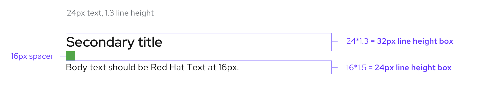
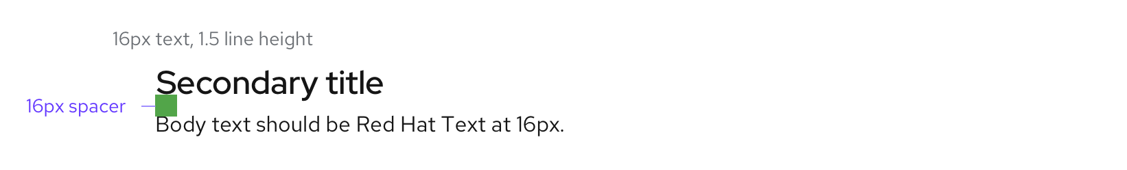
Line height and spacing
Spacing represents margins above and below text. When measuring spacing in text-based content, plan for line height. To get the correct line height in pixels, multiply line height by text size. Use spacers to provide appropriate spacing between lines of text.
For example, if a body of text uses a line height of 1.5 and the body text size is 16px, the final line height would be 24 px (16 * 1.5 = 24). In this case, include the 24px line height as part of the text when creating designs in the design software. Visit the Spacers page for more information about spacer usage.
Note that use of the text and title components will automatically apply the proper line height and spacing according to the specified text style.
View source on GitHub
